Thursday, December 18, 2008

Last one before Christmas

On Wednesday of this week I took a flying visit to Auckland, there and back in one day. I hired a car and visited two exhibitions, POST Stitch curated by Kate Wells at Lopdall House, Titirangi (closes 8 February), and No Rules curated by Rosemary McLeod, Objectspace, Ponsonby Road (closes this weekend). Both these exhibitions celebrate textile arts and should continue to be referenced as to the state of the art in NZ. I felt very heartened when viewing the message and/or content in many of the works. When the very best of execution is combined with a thought provoking message, then the bells begin to ring and I inwardly sing hallelujah!
I would love to say more, but its almost Christmas and we have other things on our minds. Below are several images from the shows. An overview of the No Rules exhibition may be viewed on No Rules: Rediscovering Embroidery courtesy of Matt Blomeley at Objectspace.
If you do have some spare time over the holidays here is a link to another blog you might like to visit www.dailyvisuals.blogspot.com. It is written by Jane Dunnewold (of the book Complex Cloth fame). She has committed herself to a year of daily entries, photographing the world around us and making artistic observations. She started on 11 November. It will make you look at things in a more thoughtful way.
My next blog will be on Friday, 2 January 2009. Until then all the very best to everyone for a great holiday season; and thank you for continuing to read my blog.


My piece in the No Rules exhibition, Object Space. Where Did This Come From challenges the inappropriate image of the girl in New Zealand.


View of the Post Stitch exhibition


My piece(s) are in the middle of this group; two pieces connected by a thread. Titled Connecting it references the connections made when communicating.


Side gallery at Lopdall House with larger pieces


Another view of Post Stitch pieces. Katherine Morrison's Sub Rosa - Under the Rose in the foreground.


Post Stitch again. Clare Plug's ASPA 156 - Erebus Voices

Next Blog: 2009 here we are!

Thursday, December 11, 2008

When a piece goes belly-up

Each time I start a new piece there is a keen sense of anticipation as to how it will turn out. Will it be my best piece ever, a so-so piece or, heavens forbid, a disaster only fit for the reject bin? All three happen of course, even to the most experienced people.
Making that decision to abandon a piece is never easy, and stressed with considerable frustration. The piece I showed you the beginnings of a few weeks back, based on a Celtic seat in northern Spain, is no longer. It got so far then I decided I didn't like the direction it was going. I tried a few remedies, until finally I did something that I knew would probably 'kill it'. It did, but that was okay.
I then started all over again with a quite different approach. This piece is now finished and I am pleased I decided to have a second attempt. It is still too early to grade its level of success but I am relatively happy with the outcome.
While working through this piece I had two unexpected new outcomes. One was purely by accident, and the other was rather more deliberate. I plan to develop these further and incorporate them into future pieces. So definitely a gain in starting again, if you know what I mean!
Anyway, I am not going to show the whole of the final piece yet as it needs to be professional photographed, but below are four details.


Next Blog: last one before Christmas

Wednesday, December 3, 2008

Magic Manutex Part 2

Following on from last week's blog about Manutex and how to mix it, I now have several photos of exercises using the Manutex and Procion MX dye mixture. These were worked at the 2007 Surface Design Association Conference in Kansas City, MO. Their 2009 conference is now on line. The Manutex dye mixture is best spread and rolled on to a sheet of glass or perspec with a sponge roller so that the mixture is absorbed evenly.


White fabric placed over a raised grid and a sponge roller partially covered with Manutex dye mixture rolled over the surface, similar to a rubbing.


For this piece I cut out a firm cardboard shape, cut nicks in the two long sides and then laced a string around the card. All of the surfaces were then sealed with a spray paint so that it would withstand washing. It has been placed under the fabric and rolled with a sponge roller and the Manutex dye mixture.


Here is the same motif used in combination with a plastic grid laid under the cloth and printed. The ovals were done the same way.


More of the same; the larger diagonal grid is that cardboard lattice often used in shop displays. The fly swat, although it makes a good print, is just that - a fly swat. I often see the use of recognisable printing objects in textile works/magazines etc and am constantly turned off by these. Unless the theme of a piece is about potatoes, using a potato masher to print (for example) will be just that - a potato masher. I feel too often there is an unwillingness to stretch further and make more meaningful prints.


On the other hand in a workshop there is a need to work through as many things as possible, without too many deep thoughts. This is an example of not using the letter stencil more creatively. The coloured background is done by spreading the Manutex dye mix like finger printing - luvly!!


A stencil cut from stencil paper.


The same stencil is printed by placing it on top of an already printed cloth and rolling over with the Manutex dye mix. Good for limited edition printing.

Next Blog: When a piece goes belly-up....

Thursday, November 27, 2008

Magic Manutex Part 1

One of my most valued dye products is Manutex (sodium alginate) available from Creative Craft Supplies. This product looks abit like brown sugar but is a seaweed extract. In dyeing processes it is used for thickening dyes for direct painting and screen printing.
I consider it to be like a good cooking stock and use Ann Johnson's recipe, keep it in a marked container in the fridge and return it to room temperature before I use it. It will last for quite some time, months in fact but may eventually go 'off', evidenced by a 'bad' smell and the growth of mould. I don't have this happen as I use it regularly.
Here's the recipe:
Dissolve 6.5 tbsps urea in three cups boiling water then strain the urea water through a cloth to remove any grit that is often found in the urea.
Sprinkle six teaspoons Manutex into the urea water and stir briskly with a hand whisk constantly for three to five minutes, then a regular stir until it cools. By this time it will have achieved the thickness of a thick runny honey. It is now ready for use, or to go into the fridge.
When I need to paint or print, I simply pour some into a container, and stir in sufficient dry dye powder for my needs. Finally I stir in dry soda ash granules (one teaspoon per cup of Manutex dye mixture) to activate the dyes. This mixture now has a useable life span of about two hours so it is best to be prepared with the fabric about to be printed/painted, although more Soda Ash can be added to re-activate.
I usually leave the fabric to cold-batch overnight. Depending on the size of the piece I will hose it down on my driveway as mentioned in a previous blog. Then it is rinsed in the conventional manner, followed by a hot wash, and a spin in the washing machine before ironing dry.
Next week I will discuss some of the outcomes in using the Manutex mixture.


My Manutex container with dates of mixing


Progress photo of Layers showing clean lines as a result of painting with the Manutex mixture. No gutta or waxed lines here.


Progress showing the blending of colours on the piece shown last week which has now gone 'belly-up' – more about this at a later date!


Detail of Flying High

Next Blog: Magic Manutex Part 2

Thursday, November 20, 2008

Weekly treats for life balance

How often do we use the words 'I'm too busy'? I am sure we are all guilty of this at times, particularly when it is used as an excuse not to do something or not be involved; it really means we would be prefer to be doing something else. Nothing at all wrong with that.
However when we use this as an excuse not to treat or spoil ourselves, then I think this is different matter and a concern. Everyone leads a busy lifestyle these days; there are things we need to do, and other things about which we make a choice. Keeping a balance between the two is never easy and I am sure everyone will agree that a life balance, however swayed, is very important.
I have always been a fan of visiting galleries, art house movies, garden visiting, and outings by myself or with friends. Enjoying coffee or lunch is the icing-on-the-cake, as well as an edible reality.
When visiting India last year, I purchased several small A6 size handmade paper books to give as gifts but decided to keep one for myself. I ruled pages into three segments and entered the date of a Monday in each. The first Monday was 20 August 2007.
Now each week I record the events and visits that I have treated myself. Some weeks there may be only one entry, but the next week may have three or four. A casual glance back through the records brings back many happy memories and reflections.
These outings feed my soul, educate me, and give me plenty to think about. I would like to think I am a more interesting person because of them.
Last week I showed you an image of a stone seat viewed on my walks in Spain. This piece is now underway and I have included a couple of progress images.


The cover image on my notebook


Six weeks in my notebook


Playing with the shapes of the seat and cutting them out of paper to view them lifesize and placed on the background of dyed silk


The start of colouring the shapes using Procion MX dyes mixed with a manutex printing paste

Next Blog: Magic Manutex

Thursday, November 13, 2008

Signatures on completed works

Okay, the latest piece is finished. Well, almost, but how does one add their signature or some type of identification and date? Painters have it reasonably easy and use a flourish across the lower right corner which claims the painting as theirs. It is not quite that easy with textiles; the nature of the fabric is not always conducive to an artistic scrawl, and textile people are often shy about such proclamations. Embroiderers can sneak a stitched name, or initials, within existing stitching where it will sit quite comfortably.
This is of course a decision for each to make and once decided, I think we would all feel the need to repeat the same signature treatment on all future work. For my own work, I don't like the idea of any signature interfering with the design and, heaven forbid, spelling my name wrong at this final stage would leave me very upset. I frequently type my own name incorrectly so it can be a real risk.
Last year a friend and I travelled north from Lower Hutt on one of those relaxed trips which included stopovers at several of those places one normally drives past with a promise that 'next time' I will definitely stop and visit. We made it into the antique shop on the Highway One corner at Bulls. There I discovered a tray of metal printing blocks and casually began to pull out the letters that formed my name. Needless to say I purchased a series that made up my name and each of the numerals, with the exception of a seven which I couldn't find. Now I use these to stamp my name on the back bottom (left when viewed from the back) hem of my pieces. I like the shapes. I already have a set of rubber stamps which would do the same thing but these metal letters I feel are abit more classy.
I have yet to find that seven but I am not too concerned. I won't need it until 2017.

The metal letter blocks, in reverse of course. The gaps are for the repeat 'a' of which there are three in my name.


A completed signature


I came across this stone seat on my walks in Spain Lifestyle Journeys I am thinking of designing my next piece on its shapes.

Next Blog: Weekly treats for life balance

Thursday, November 6, 2008

Building myself a new website

I have a confession to make. I am a closet computer buff. This technology has had me extending myself to discover more of its capabilities for quite sometime now. This can be extremely frustrating at times, and I often feel I take the longest journey possible to get to where I want to be but I just can't let it beat me.
Recently I felt I needed to re-model my website. I like having a website but hiring a professional website builder can be expensive. This is how I first started with a website some years ago, and I have always been able to add/delete/alter its content. This is rather like unlocking the door to a house, going inside and shifting/adding/removing some of the furniture, then locking the door again on the way out. So I already have some skills in websites. With the desire for a new website, I decided that this time I was going to build 'the house' itself. And, I did.
An internet search revealed a number of website building programmes which allowed one to build their own website, for free. I chose VodaHost.com, from the USA. I had my new website content prepared, and downloaded their programme. A very comprehensive series of tutorials 'walked' me through each stage of the process. It was still one of the biggest learning curves I have experienced, but I finally had my nine website pages prepared. I then had to transfer my domain name from my NZ server, to VodaHost in the USA. This was achieved but then I couldn't work out why my email was not working, until I re-read all my instructions and of course I had to re-instate my email with my USA server! Dumb, I know, but true!
VodaHost has a very supportive customer programme and respond quickly and efficiently. I have installed their SpamAssassin and a comprehensive site meter. There are heaps of other features I can select from and install, when I feel the need for another challenge. And best of all, their annual fee is a fraction of what it had been costing me in the past.
My website is still www.dianaparkes.co.nz. Take a look, open up the nine pages and click on the smaller images for enlargements and their details.
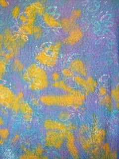
Inbetween times I have been steadily working away on things textile. Here is an image of three metres of double weave crinkle silk recently dyed for a client.


Partway through, soya wax and discharge printing, dye


Overall discharge as I decided that the colours were too strong. Then I outlined the leaf design


Leaf shapes highlighted with additional colour

Next Blog: Signatures on completed works

Thursday, October 30, 2008

Butter Yellow, Butter Yellow and more Butter Yellow

Recently I was given the task of dyeing almost 20 metres of white silk for five bridesmaid's dresses as the colour was not available in the shops. The colour, and garment style, was chosen from a wedding magazine but the photo had been spot-lighted and this bounced back off the fabric making it somewhat difficult to determine exactly what was the colour.
Most fortunately, more than the actual fabric required had been purchased, so I was able to sample colours to get to the correct colour ie butter yellow. I made it with the fourth sample. The first sample was very much to see how the colours appeared on this particular silk, as one dye bath colour can vary on different fabrics (see Blog 31 August). The second sample was still too strong; the third was better but too 'cold'. At this point I decided to reduce the yellow dye and add an ecru dye. The ecru dye is an odd colour and insignificant on its own but will 'warm' and give some depth to a pale colour. The fourth sample was successful; we were both satisfied.
Then, of course, I had to repeat this with the bulk of the silk. There was far too much fabric to dye all in one dye bath by one individual, so it was cut into four sections and the cut ends overlocked to prevent fraying during the dye processes. I always keep very good records when I know I have to repeat a colour. The weight of each length was recorded and the dye, water, salt and soda ash quantities, plus the time frames for working through the processes were carefully determined. The fourth sample was the 'copy' to repeat. I religiously repeated this four more times, physically working the dye baths so that the resulting colour had no resisted areas, and adding the chemical solutions in small increments. After rinsing and washing all lengths were ironed dry to give a professional finish.
Well, I did it! And I was delighted that the four pieces, and along with the original successful sample all matched beautifully. What a relief, whew..... The butter yellow fabric will now go to the dressmaker for her input. I am sure it will be a wonderful wedding.


The four samples, the top one being the chosen one


Ironing a silk length dry after dyeing


The four lengths, and the sample, awaiting collection

Next Blog: Building myself a new website

Thursday, October 23, 2008

Washing, but not you or your laundry

Washing fabric for creative work, whatever it is destined for, is a common practice and specific care is required to achieve a good outcome. Here are a couple of my best practices.
First of all, unbleached calico (muslin for those in the USA). This basic cotton fabric is a mainstay in every textile lover's stash. I might confess here that I do love the musky earthy smell of unwashed calico, odd I know, but perhaps it is the promise for what it might become. I buy this in bulk and because it comes heavily coated in a fabric dressing it needs to be washed well before use and I prefer to do this in about 10 metre lengths. Calico does need plenty of washing to remove that dressing, and my method is to soak the 10 metre length in a hot bath overnight (I did take a photo of this when doing my last lot but it qualified for this year's most boring photo!). Next morning the bath water is ugh! Rather like dirty pond water. The soaked calico then goes through a hot wash, no detergent, in the washing machine. Then it is draped over the washing line, not pegged so as to avoid peg marks, before being rolled on to a tube. Each piece then gets ironed before it is used.
Secondly, and this may not be relevant to everyone. When working on my WholeCloth Banners I often paint on a (manutex) thickened dye which, at this point does not cover all the white fabric. This is left to cold-batch (more about this at a later date) but will need to be washed to remove any surplus dye. I often want the white fabric to remain white and not get back-stained during the washing. Although the applied dye may be dry at this point, I still handle the fabric carefully and spread it out on my driveway. Then with a strong jet on the garden hose,I blast the fabric. Any surplus dye simply lifts off and floats away. Then the fabric is given its normal wash, and ironed dry ready to start the next procedure.
This week's photos show the beginnings of a piece stretched on a frame with design structure lines applied using Procion MX dye and manutex; plus two uncompleted pieces, dye painted and washed (one still on the driveway), with their white areas remaining unblemished.

Lots of white fabric here

No backstaining at all...

I've just been hosed!

Next Blog: Butter Yellow, Butter Yellow and more Butter Yellow

Friday, October 17, 2008

The World of Wearable Arts (WOW)

The 20th season of The World of Wearable Arts has once again delighted the 35000 plus enthusiastic audience. Whilst acknowledging the input of those in the Nelson region, the shift to Wellington has certainly allowed the show to 'fly'. I recall Suzie Moncrieff saying in a radio interview that in Nelson performers could only come up from under the raised performance area, while in the TSB Arena they can now also come down from the gantries in the ceiling. And fly they do! The performers and the behind-the-scene team are incredibly slick and play a major part in carrying the show. And the overall winning entry never seems to fail, it always deserve the honour; and the viewer's choice does the same – who could resist Perfect Pins!
With any event that continues over a lengthy period of time, the 'goal posts' need to rise to keep that spark which is its very essence. What we considered had the wow factor five years ago, might not pull the same punch this year. Trends and creative design skills constantly shift and reflect the maturity of not only its designers (people who submit garments for selection) but also the designers of the supporting acts. Getting these all to come together is surely a mighty challenge.
It has now been confirmed that WOW will be continuing for another four years in Wellington. I can't imagine anyone being upset with this!
The images following here have no connection with WOW whatsoever, they are simply details from a piece completed this week. I am pleased with the outcome. However, I often wonder whether this satisfaction reflects relief that I have finally resolved and completed the piece, rather than the quality of the outcome. If I still feel the same satisfaction in a few months time when I re-visit the piece, then my feelings are justifed. Time is always the best judge.


Next Blog: Washing, but not you or your laundry

Thursday, October 9, 2008

Vat Dyes, what are they?

In 2005 I attended my first Surface Design Association http://www.surfacedesign.org conference in Kansas City, MO, USA. I was lucky to get into the master class on discharge techniques ie selective removal of colour from an already dyed ground cloth. Among other things, we worked with Vat dyes which were completely new to me.
Vat dyes are similar to Indigo. The dye powder is soluble in water, but has no affinity at all for fabrics, until it goes through a reduction process. This process involves water with a temperature of 50ºc – 60ºc, Vat dye powder, Lye, Soda Ash and Thiox (Thiourea Dioxide). The reduced dye is now in its leuco form and may differ in colour from the original dye itself. After dyeing the fabric is re-oxidized when exposed to the air again and regains the intended colour. Magic!
The beauty of Vat Dyes is that they simultaneously remove the original ground colour from a fabric and replaces it with a new colour. Do not get confused here with overdyeing which will be affected by the original ground colour ie blue dyed over a yellow will produce a green. Blue Vat dye over yellow will remain blue, it has removed the yellow and replaced it with the blue. As you can imagine Vat Dyes are great for resist techniques where parts of a fabric are bound to avoid any colour reaching within the folds.
The photos show this process on some silk seersucker.


The silk dyed chartreuse (Procion MX), and portions bound


The same piece after it has been in a navy vat dye bath


The resulting cloth being unbound, and revealed

Next Blog: The World of Wearable Arts (WOW)

Thursday, October 2, 2008

Determining Fibre Content

Unless one is dyeing fabrics there may not be any need to know the fibre content of any fabric. The colours, patterns and the intended use for a particular fabric, are the prime considerations.
In dyeing fabric however, determining the fibre content of any fabric is the first consideration before any fabric hits the dye water. If the right dye for a particular fabric is not used, all will be in vain.
Recently I purchased a piece of fabric labelled linen/polyester. I knew that my dyes (Procion MX) would not touch the polyester but it would be interesting to see what would happen to the linen component. Nilch, nothing, not a hint of colour! Obviously no linen present. This piece of fabric did have a 'linen' look so perhaps that justified its 'linen' classification. All was not lost however, and Plan B had me painting a repeating motif on to this fabric using a textile pigment (see photo below).
Many fabrics in shops of course do have labels stating their fibre content, and proportions if more than one type of fibre is blended in the fabric. However, it is not always quite that simple and standard practice is to burn a small snippet and observe the burning characteristics. I have discovered a good Fiber Burn Chart on www.ditzyprints.com/dpburnchart.html. However, I am not sure when this was written as she states that she carries in her purse a pair of collapsable scissors and a lighter in an old candy tin. Um.... not sure whether I would like to have such items found in my purse at Customs, or anywhere else in fact! At The Fabric Warehouse, Sar Street, Thorndon, Wellington, they have their own cigarette lighter for this very purpose.
Earlier in the blogs I refered to an url to use if you wish to receive this blog as a regular email. This site, despite originally being accessible, seemed to go awol. It is now back, and 'beta' (better) so they say!. Visit http://www.beta.rssfwd.com and follow the three simple instructions. If this site doesn't open by clicking on the url, copy and paste it into your Google search and go from there.


FL16 Painted 'Linen'/Polyester 150cm x 1.4m


And just to be cheerful in this time of early spring. This photo came across the internet. Wouldn't we all like to have roses like these in our gardens!

Next Blog: Vat Dyes, what are they?

Thursday, September 25, 2008

Using Your Digital Camera as a Design Tool Part 3

This is the third article on using your digital camera as a design tool. The first posting was about using your camera to record the progress of a project and allowing it to be viewed in another form. The second outlined how an image can be cropped on the screen to assess whether portions would be best removed for the overall benefit of the project. See Archives for these postings. It is now time for Part 3.
In the second posting I showed you a piece of my work which I cropped on the computer. I am sure you will agree that cropping made a huge improvement. I was still concerned about this piece and although I was happy and familiar with the colours I had originally used in dyeing this piece, I was not convinced that they were right. In trying to determine what I might do I printed out a colour image of the cropped piece on to ordinary computer paper. I then mixed some dye colours with water (no chemicals were added) and painted over the coloured print. As the dye water is transparent the image showed through. What this did was to alter all the colours in the coloured print. This was an eureka moment and everything blended together in a far more appealing manner.
It was then a matter of overdyeing the whole piece in an immersion dye bath with the chosen colour. I also thought ahead and dyed some plain white fabric at the same time and this was used to bind the edges. I was finally satisfied with the outcome.
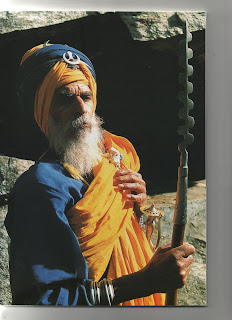
The strong orange colour reminded me of the headwear worn by the Sikhs on their pilgrimages in the lower slopes of the Himalayas which I visited in 2007. The piece is called Out of India and reflects the paths and tracks used for the journey to the shines, and the rest stations along the way.
I am showing the cropped image again in its original colours, and the final piece.

Out of India, cropped, original colours


Out of India, overdyed, 190 x 46cm


A Sikh gentleman in the Himalayas (Ref: Pilgrimage to Hemkunt, Sondeep Shankar)

Next Blog: Determining Fibre Content

Thursday, September 18, 2008

The power of a painting

As you may have already gathered I have been in Spain recently. I had a brief stop-over in Madrid and, among many other things, visited the Prado National Museum www.museopradomcu.es. Recognised as one of the world's major art galleries it houses many masterpieces. Two paintings impressed me significantly. One was Diego Velázquez's Las Meninas, 1656, and Francisco de Goya's The Third of May 1808, 1814. Both these paintings are well known and draw an audience of reverent admirers at all times.
These two paintings are huge, and impressive. They have marvellous story lines and, particularly in the case of The Third of May, 1808, the knowledge of what is about to happen in the next second or so, is perhaps its greatest attribute. In Las Meninas the royal family and its servants are informally portrayed and the artist's gaze draws us in to join them. It is considered to be a painting about painting.
I have often viewed these paintings in books, along with many other favourites, but have never taken much notice of the actual size of each although these details are always noted in the captions. Recently I borrowed a book from the Library and came across photos of each. Wow, I have seen these 'in the flesh' as it were, and keenly re-studied them again. This time I noted the sizes. The Las Meninas is 'only' 318 x 276cm, and the The Third of May 1808 is 'only' 266 x 345cm. I say 'only' because I recall these two paintings as being significantly larger than recorded. The paintings hanging nearby were smaller – perhaps this helped to enlarge the two paintings. Perhaps in was just my misconception combined with the importance of these two paintings, that had me seeing larger than reality. Whatever it was that did it, these were memorable powerful moments.
Goya's The Third of May 1808 was displayed in a feature exhibition of his work. It displayed preliminary sketches for his major works, many of which showed the shocking consequences of war and conflict.


The Third of May 1808, Goya, 1814


Las Meninas, 1656, Velázquez

Next Blog: Using your Digital Camera as Design Tool Part 3